KQL Demo - Log Analytics Workspace
All queries in this tutorial use the Log Analytics demo environment. You can use your own environment, but you might not have some of the tables that are used here. Because the data in the demo environment isn't static, the results of your queries might vary slightly from the results shown here.
Count rows
The InsightsMetrics table contains performance data that's collected by insights such as Azure Monitor for VMs and Azure Monitor for containers. To find out how large the table is, we'll pipe its content into an operator that counts rows.
A query is a data source (usually a table name), optionally followed by one or more pairs of the pipe character and some tabular operator. In this case, all records from the InsightsMetrics table are returned and then sent to the count operator. The count operator displays the results because the operator is the last command in the query.
InsightsMetrics | countHere's the output:
1,263,191
Filter by Boolean expression: where
The AzureActivity table has entries from the Azure activity log, which provides insight into subscription-level or management group-level events occuring in Azure. Let's see only Critical entries during a specific week.
The where operator is common in the Kusto Query Language. where filters a table to rows that match specific criteria. The following example uses multiple commands. First, the query retrieves all records for the table. Then, it filters the data for only records that are in the time range. Finally, it filters those results for only records that have a Critical level.
Note
In addition to specifying a filter in your query by using the TimeGenerated column, you can specify the time range in Log Analytics. For more information, see Log query scope and time range in Azure Monitor Log Analytics.
AzureActivity
| where TimeGenerated > datetime(10-01-2020) and TimeGenerated < datetime(10-07-2020)
| where Level == 'Critical'
Select a subset of columns: project
Use project to include only the columns you want. Building on the preceding example, let's limit the output to certain columns:

Show n rows: take
NetworkMonitoring contains monitoring data for Azure virtual networks. Let's use the take operator to look at 10 random sample rows in that table. The take shows some rows from a table in no particular order:

Order results: sort, top
Instead of random records, we can return the latest five records by first sorting by time:
You can get this exact behavior by instead using the top operator:

Compute derived columns: extend
The extend operator is similar to project, but it adds to the set of columns instead of replacing them. You can use both operators to create a new column based on a computation on each row.
The Perf table has performance data that's collected from virtual machines that run the Log Analytics agent.

Aggregate groups of rows: summarize
The summarize operator groups together rows that have the same values in the by clause. Then, it uses an aggregation function like count to combine each group in a single row. A range of aggregation functions are available. You can use several aggregation functions in one summarize operator to produce several computed columns.
The SecurityEvent table contains security events like logons and processes that started on monitored computers. You can count how many events of each level occurred on each computer. In this example, a row is produced for each computer and level combination. A column contains the count of events.

Summarize by scalar values
You can aggregate by scalar values like numbers and time values, but you should use the bin() function to group rows into distinct sets of data. For example, if you aggregate by TimeGenerated, you'll get a row for most time values. Use bin() to consolidate values per hour or day.
The InsightsMetrics table contains performance data that's organized according to insights from Azure Monitor for VMs and Azure Monitor for containers. The following query shows the hourly average processor utilization for multiple computers:

Display a chart or table: render
The render operator specifies how the output of the query is rendered. Log Analytics renders output as a table by default. You can select different chart types after you run the query. The render operator is useful to include in queries in which a specific chart type usually is preferred.
The following example shows the hourly average processor utilization for a single computer. It renders the output as a timechart.

Work with multiple series
If you use multiple values in a summarize by clause, the chart displays a separate series for each set of values:

Join data from two tables
What if you need to retrieve data from two tables in a single query? You can use the join operator to combine rows from multiple tables in a single result set. Each table must have a column that has a matching value so that the join understands which rows to match.
VMComputer is a table that Azure Monitor uses for VMs to store details about virtual machines that it monitors. InsightsMetrics contains performance data that's collected from those virtual machines. One value collected in InsightsMetrics is available memory, but not the percentage memory that's available. To calculate the percentage, we need the physical memory for each virtual machine. That value is in VMComputer.
The following example query uses a join to perform this calculation. The distinct operator is used with VMComputer because details are regularly collected from each computer. As result, the table contains multiple rows for each computer. The two tables are joined using the Computer column. A row is created in the resulting set that includes columns from both tables for each row in InsightsMetrics, where the value in Computer has the same value in the Computer column in VMComputer.

Assign a result to a variable: let
Use let to make queries easier to read and manage. You can use this operator to assign the results of a query to a variable that you can use later. By using the let statement, the query in the preceding example can be rewritten as:

The following sections give examples of how to work with charts when using the Kusto Query Language.
Chart the results
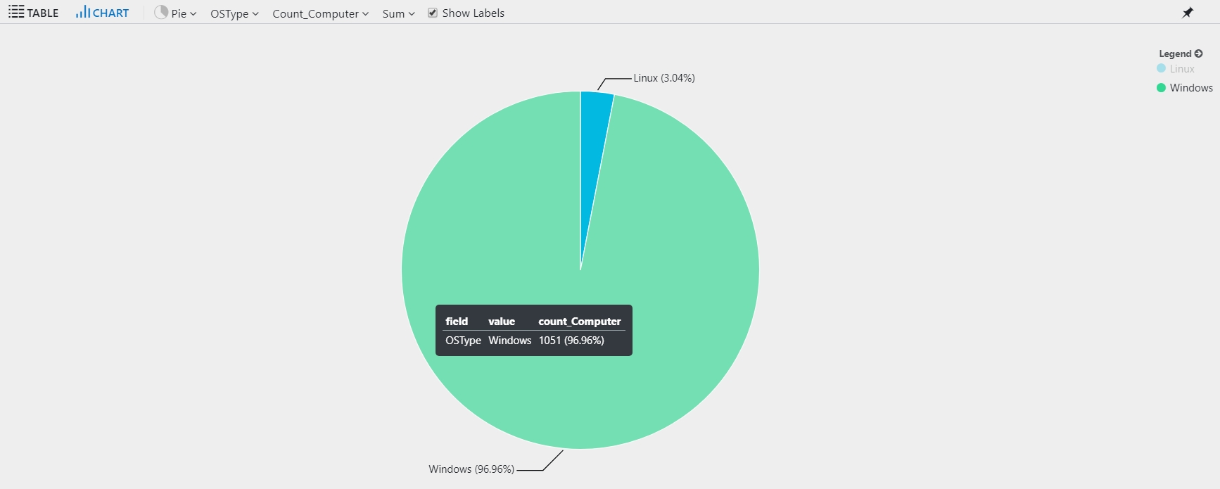
Begin by reviewing the number of computers per operating system during the past hour:
By default, the results display as a table:
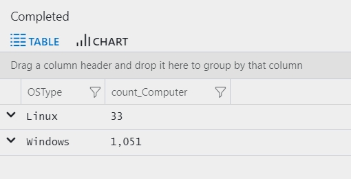
For a more useful view, select Chart, and then select the Pie option to visualize the results:
Timecharts
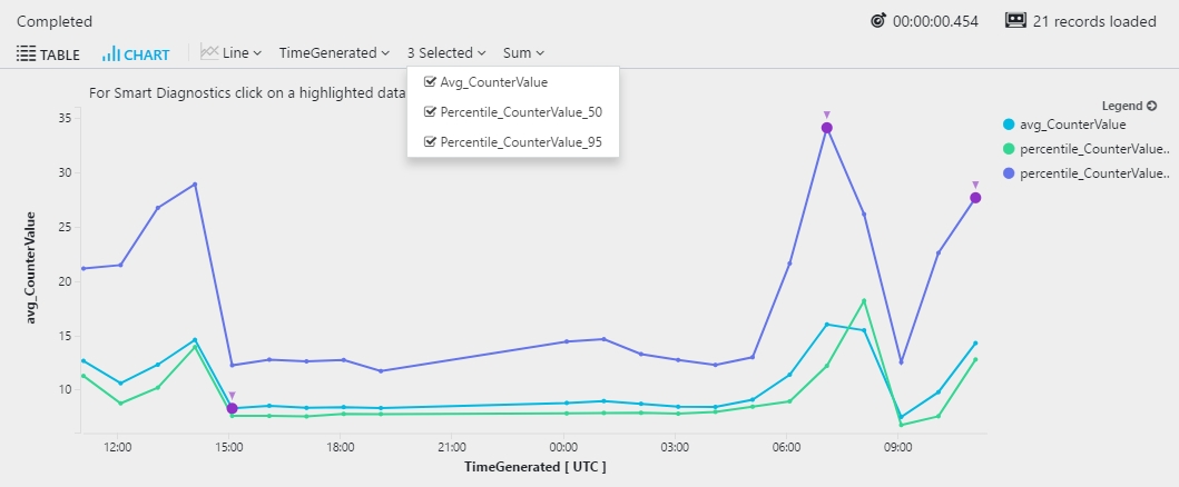
Show the average and the 50th and 95th percentiles of processor time in bins of one hour.
The following query generates multiple series. In the results, you can choose which series to show in the timechart.
Select the Line chart display option:
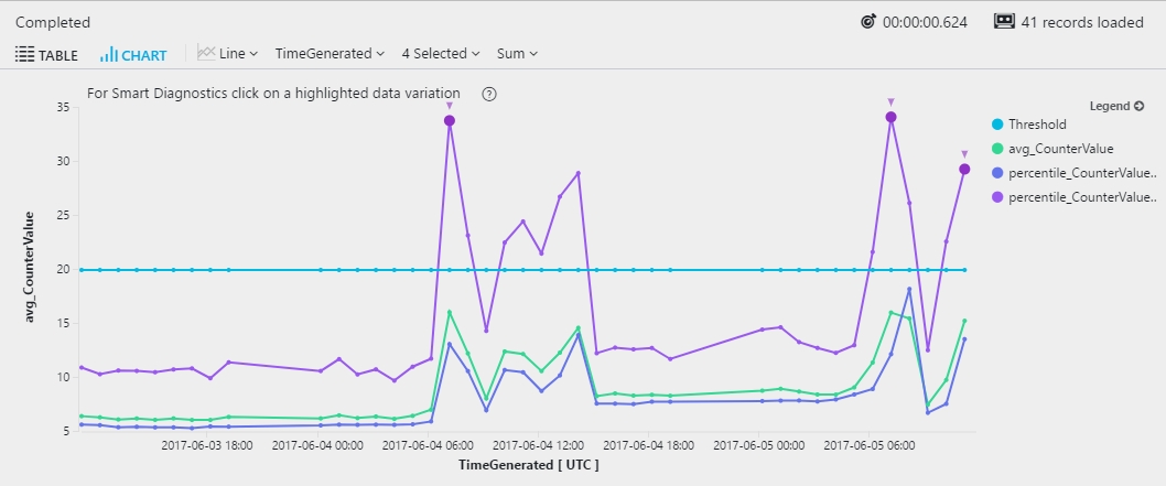
Reference line
A reference line can help you easily identify whether the metric exceeded a specific threshold. To add a line to a chart, extend the dataset by adding a constant column:
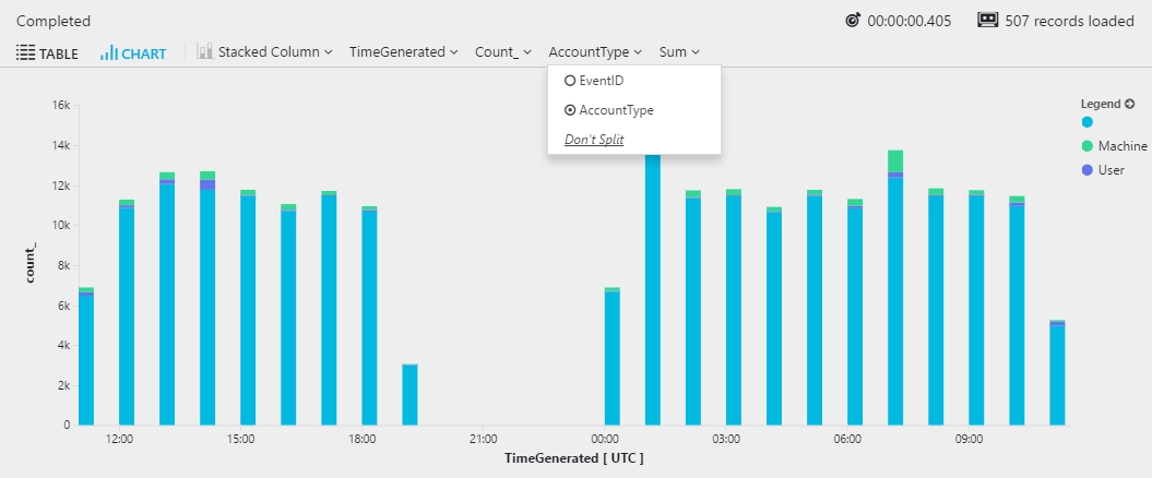
Multiple dimensions
Multiple expressions in the by clause of summarize create multiple rows in the results. One row is created for each combination of values.
When you view the results as a chart, the chart uses the first column from the by clause. The following example shows a stacked column chart that's created by using the EventID value. Dimensions must be of the string type. In this example, the EventID value is cast to string:
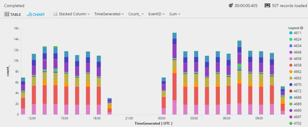
You can switch between columns by selecting the drop-down arrow for the column name:
Smart analytics
This section includes examples that use smart analytics functions in Azure Log Analytics to analyze user activity. You can use these examples to analyze your own applications that are monitored by Azure Application Insights, or use the concepts in these queries for similar analysis on other data.
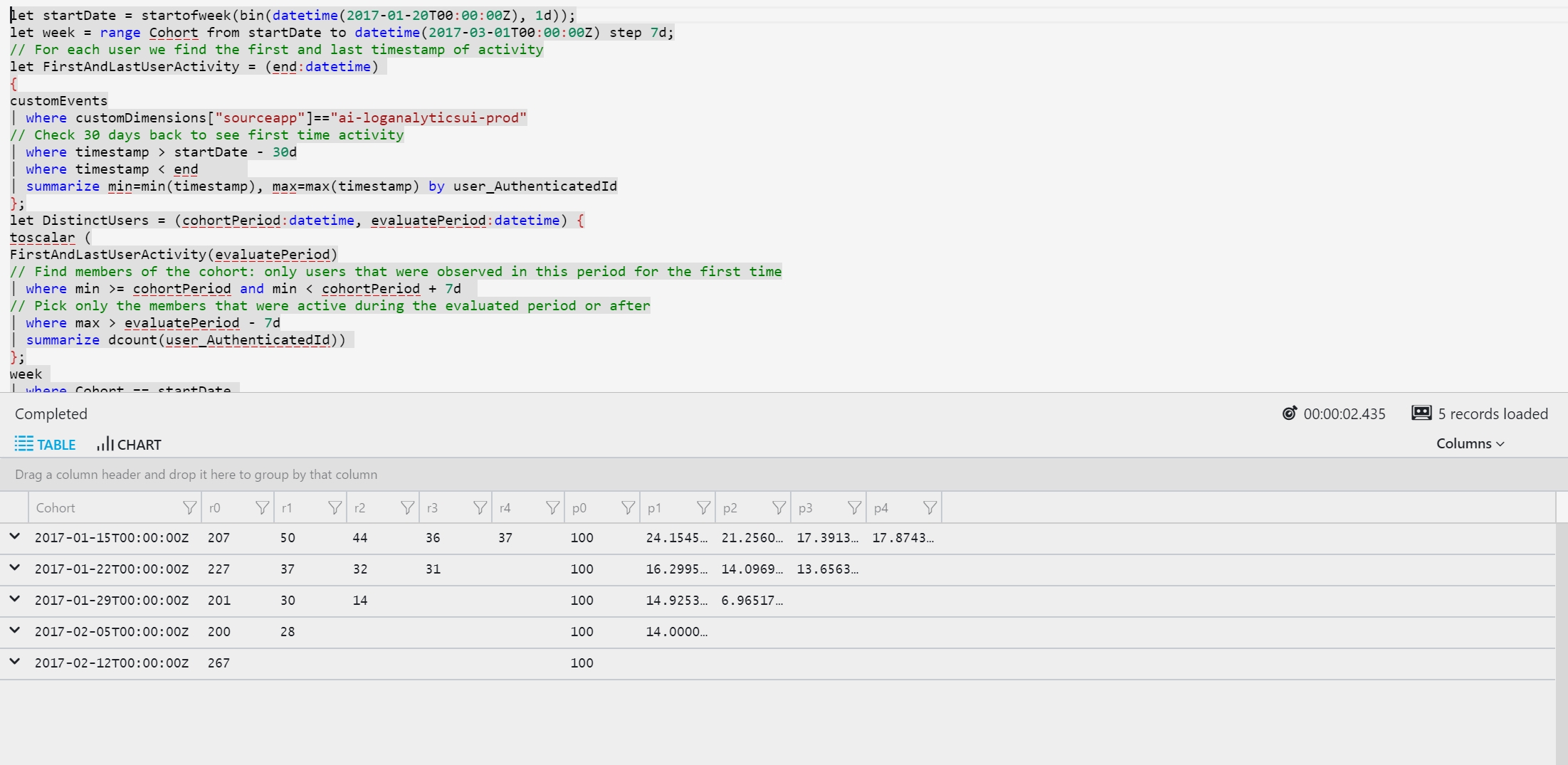
Cohorts analytics
Cohort analysis tracks the activity of specific groups of users, known as cohorts. Cohort analytics attempts to measure how appealing a service is by measuring the rate of returning users. Users are grouped by the time they first used the service. When analyzing cohorts, we expect to find a decrease in activity over the first tracked periods. Each cohort is titled by the week its members were observed for the first time.
The following example analyzes the number of activities users completed during five weeks after their first use of the service:
Here's the output:
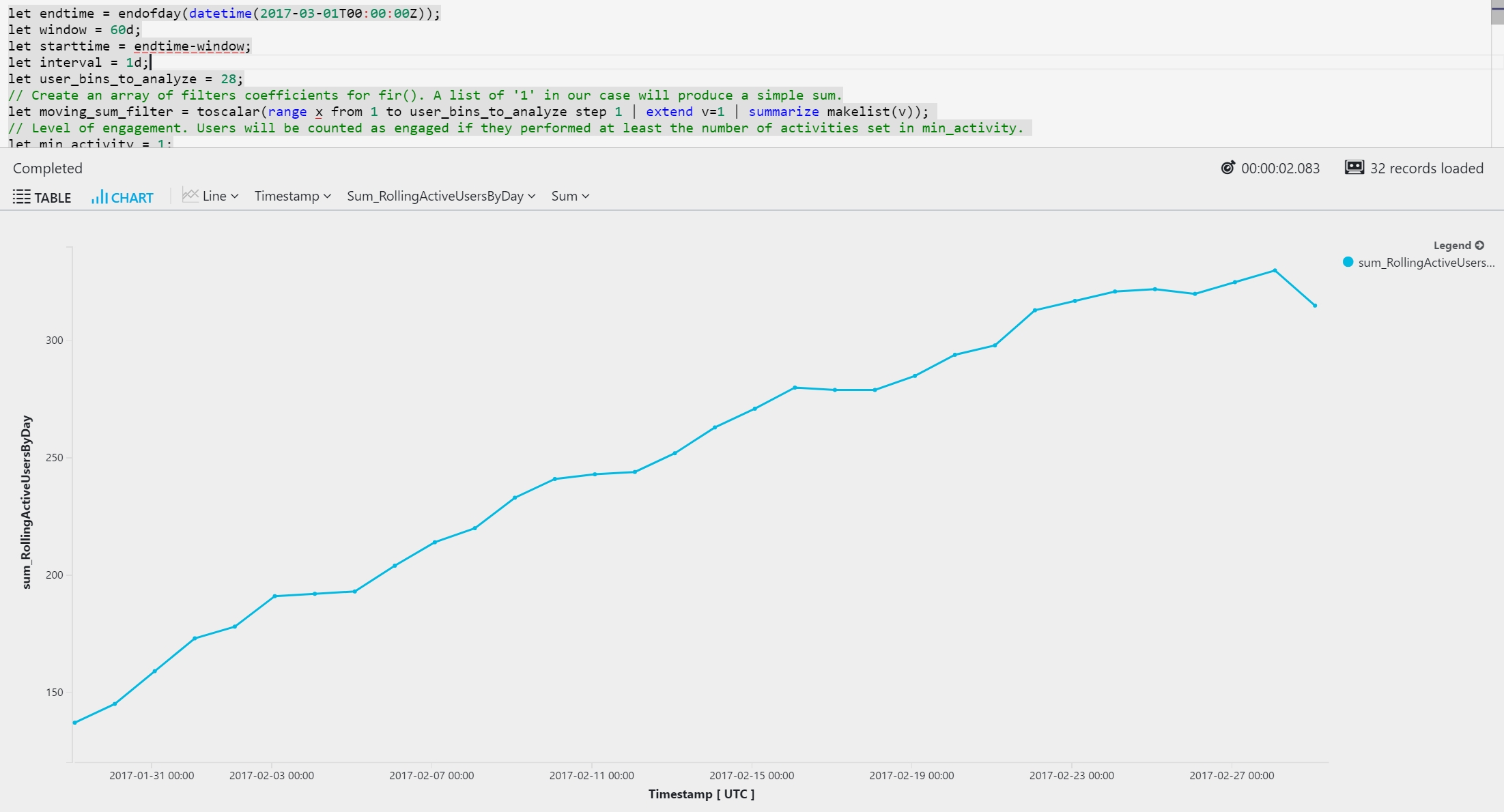
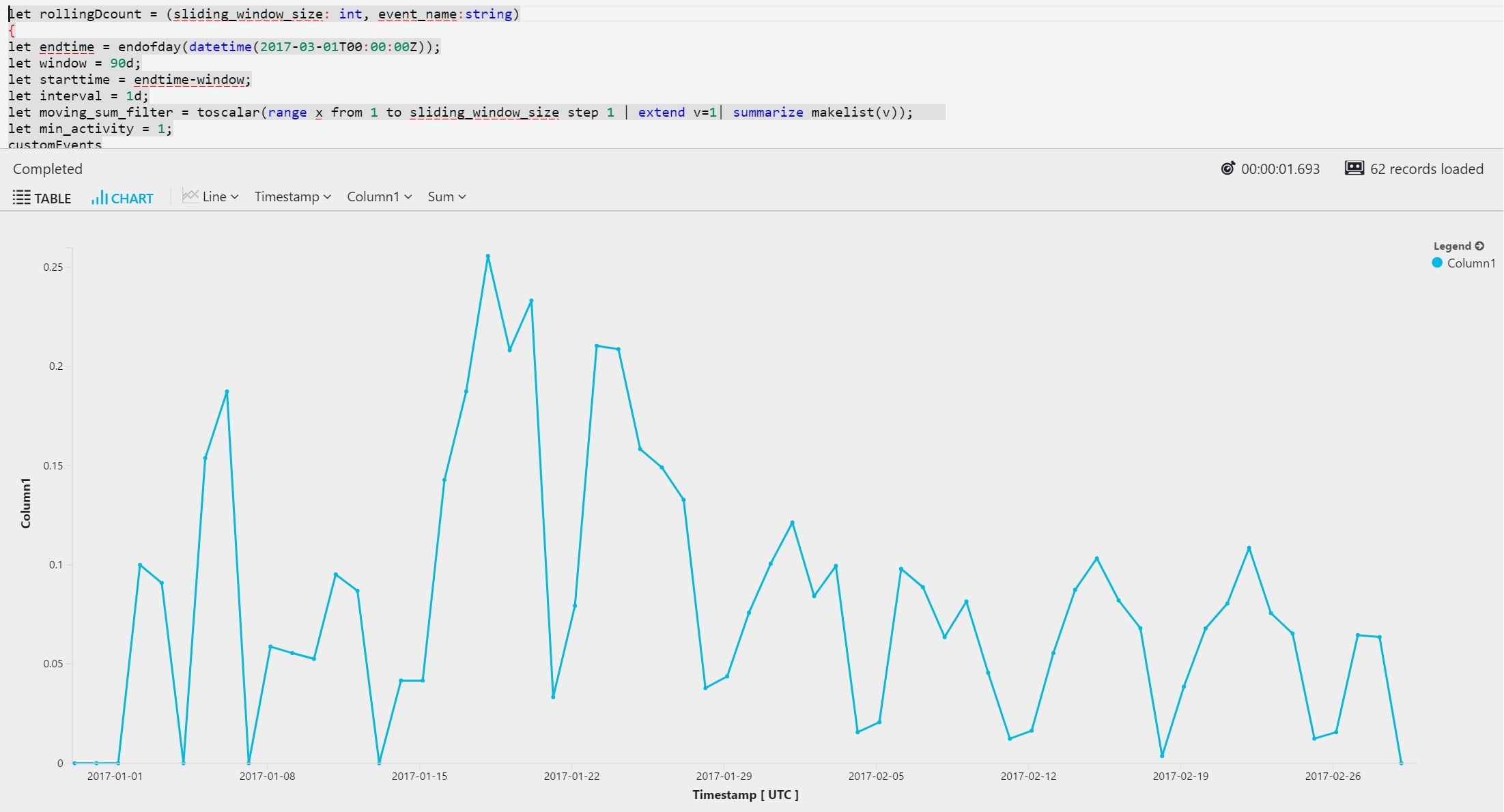
Rolling monthly active users and user stickiness
The following example uses time-series analysis with the series_fir function. You can use the series_fir function for sliding window computations. The sample application being monitored is an online store that tracks users' activity through custom events. The query tracks two types of user activities: AddToCart and Checkout. It defines an active user as a user who completed a checkout at least once on a specific day.
Here's the output:
The following example turns the preceding query into a reusable function. The example then uses the query to calculate rolling user stickiness. An active user in this query is defined as a user who completed a checkout at least once on a specific day.
Here's the output:
Regression analysis
This example demonstrates how to create an automated detector for service disruptions based exclusively on an application's trace logs. The detector seeks abnormal, sudden increases in the relative amount of error and warning traces in the application.
Two techniques are used to evaluate the service status based on trace logs data:
Use make-series to convert semi-structured textual trace logs into a metric that represents the ratio between positive and negative trace lines.
Use series_fit_2lines and series_fit_line for advanced step-jump detection by using time-series analysis with a two-line linear regression.
Last updated